
One of the challenges in frontend development is isolating and testing components, especially those made with frameworks like React, Vue, Svelte and others. It is often required to build out other related parts of the application just to test a single component. This gets harder when trying to simulate unique edge cases which requires orchestrating particular configurations with other components. On top of this, tracking and documenting the various state and props of components’ gets tedious to maintain.
This is where Storybook comes in, which works with many frontend frameworks. It’s an open source tool which makes it easy to test and document components. Let’s dive in.
The final code for this tutorial is visible on this repository for reference.

Prerequisites:
We are going to use React for this tutorial. Create a new React project with the following command.
npx create-react-app sb-testrun
Now that we have our React application, change directory in your terminal to your new application and run the storybook installer. Storybook will automatically determine which framework you’re using.
npx storybook init
You’ll notice a new .storybook directory that contains some configuration files. We don’t need to touch these at the moment.
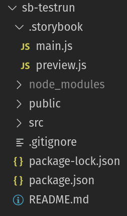
Notice that your package.json has a couple of new scripts that weren’t there before.
    "storybook": "start-storybook -p 6006 -s public",
    "build-storybook": "build-storybook -s public"
We can run Storybook and see the storybook interface by running npm run storybook. This will open a tab with your Storybook.
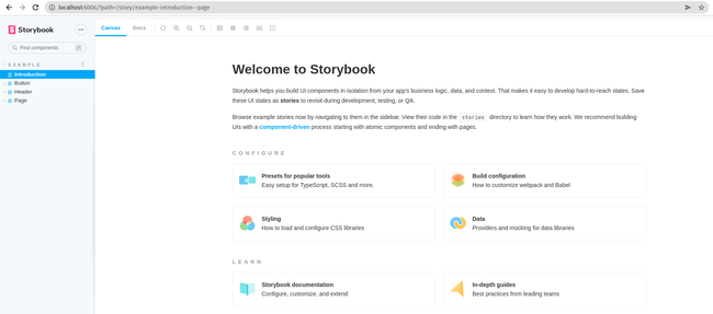
There isn’t much other than some links and example“stories”, but soon enough we’ll build out our Storybook.
Let’s build a basic component which we can then test using Storybook.
import { useState } from "react";
function Counter(props) {
  const [count, setCount] = useState(0);
  const addOne = () => setCount((previous) => previous + 1);
  return <button onClick={addOne}>{count}</button>;
}
export default Counter;
This will provide us a basic button that displays the number of times it has been clicked. To see this on our storybook dashboard we will need to create a story.
A story captures the rendered state of a UI component. Developers write multiple stories per component that describe all the“interesting” states a component can support.
The storybook dashboard will show any “stories” we create. These are created with files called
import React from 'react';
import Counter from '../components/Counter';
// This exported object determines what is shown on the dashboard
export default {
  title: 'Counter',
  component: Counter,
};

export const Basic = () => <Counter/>;
If we open up Storybook with npm run storybook you should see Counter now added to our list of stories and under it the “Basic” story. You can now see and interact with the component in isolation but so far not much else.
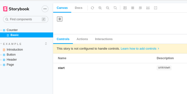
Let’s modify the component so we can set the starting value of the counter. Update the 'Counter.js' to look like so:
import { useState } from "react";
function Counter({start = 0}) {
  const [count, setCount] = useState(start);
  const addOne = () => setCount((previous) => previous + 1);
  return <button onClick={addOne}>{count}</button>;
}
export default Counter;
Now we can add stories showing the counter with different starting values, let’s update Counter.stories.js like so:
import React from 'react';
import Counter from './components/Counter';
// This exported object determines what is shown on the dashboard
export default {
  title: 'Counter',
  component: Counter,
};

export const Basic = () => <Counter/>;
export const Five = () => <Counter start={5}/>;
export const Ten = () => <Counter start={10}/>;
Now imagine we had a much more complex component with many props and many different possible permutations. Using Storybook we can create stories for many different possibilities without having to edit the actual application each time we want to test a particular scenario.
Let’s edit our story so that we can set the props directly from storybook. Luckily, this can be done quite easily by create a template and using it our stories. Update your Counter.stories.js like so:
import React from 'react';
import Counter from './components/Counter';
// This exported object determines what is shown on the dashboard
export default {
  title: 'Counter',
  component: Counter,
};
// create a template that maps arguments to the component
const Template = (args) => <Counter {...args}/>;
// Define a story that uses the template
export const Basic = Template.bind({});
// Define the starting Arguments for that story
Basic.args = {
    start: 0
}
export const Five = () => <Counter start={5}/>;
export const Ten = () => <Counter start={10}/>;
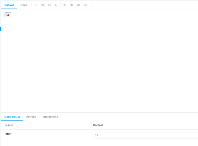
Now when we look at the Storybook dashboard we can set the start prop from Storybook, then hit the little refresh button next to “docs” to have it rerender with the new arguments.
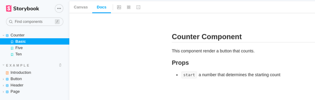
We can also use our Storybook dashboard as documentation. We can use MDX to write our documentation. In the src/stories folder create a Counter.mdx file. This will act as documentation for Counter component. The contents of this file are below.
## Counter Component
This component render a button that counts.
### Props
- `start` a number that determines the starting count
We can display this on the dashboard for documentation by updating our Counter.stories.js like so, adding a ‘docs’ parameter:
import React from 'react';
import Counter from '../components/Counter';
import CounterDocs from './Counter.mdx';
// This exported object determines what is shown on the dashboard
export default {
  title: 'Counter',
  component: Counter,
  // Here is where we set the docs which we imported above
  parameters: {
    docs: {
      page: CounterDocs
    }
  }
};
// create a template that maps arguments to the component
const Template = (args) => <Counter {...args}/>;
// Define a story that uses the template
export const Basic = Template.bind({});
// Define the starting Arguments for that story
Basic.args = {
    start: 0
}
export const Five = () => <Counter start={5}/>;
export const Ten = () => <Counter start={10}/>;
Now if you click on “Docs” on the Storybook dashboard when browsing the Counter story you’ll see our documentation.
We can do a spot test where we manually inspect the component in the browser and change the props using the dashboard to see their effect. However, we can easily introduce automated testing with one of Storybook’s many integrations with testing libraries. Let’s use Jest.
To setup testing, run the following command to install the necessary libraries:
npm install @storybook/test-runner jest@27 --save-dev
Add the following to your scripts in package.json:
"test-storybook": "test-storybook"
Run npm run test-storybrook and it will run all your stories to make sure they all run successfully and print out the results. So now all your stories can double as unit tests! The test-runner can go a lot deeper into snapshot testing and other functionality.
Storybook provides a suite a tools to allow frontend developers to sleep better at night by enabling them to experience their components in isolation, create documentation and run a variety of unit tests, snapshot tests, accessibility tests and more.
Meticulous creates and maintains an exhaustive suite of e2e ui tests with zero developer effort.
This quote from the CTO of Traba sums the product up best: "Meticulous has fundamentally changed the way we approach frontend testing in our web applications, fully eliminating the need to write any frontend tests. The software gives us confidence that every change will be completely regression tested, allowing us to ship more quickly with significantly fewer bugs in our code. The platform is easy to use and reduces the barrier to entry for backend-focused devs to contribute to our frontend codebase."
This post from our CTO (formerly lead of Palantir's main engineering group) sets out the context of why exhaustive testing can double engineering velocity. Learn more about the product here.

Meticulous creates and maintains an exhaustive suite of end-to-end UI tests with zero developer effort. Learn more here.


